Usability Problems
September 9, 2013
UX
1646 words, a 8 minutes read
Some people, usually technicians, think that their programs are self-explanatory, intuitive and easy to use. Most of the time, this is not the case. Why? We’re technicians. We think in another way that most people do. Remember your math teacher saying “it’s all logical!”? That’s how people using these programs think.
![]()
This blog post is my opinion what is important in designing your application for usability. I’m not a guru or something, I’ve just read a lot and will try to summarize what I personally think and what I learned.
Do not overwhelm
This is by far the biggest issue. Technicians think, people want to know EVERYTHING their program does. Please, please: I do not want to know that you’ve just moved A to position B. Well, you can write (and I encourage you to do so) in a debugging log file.
I really hope everyone is getting this message. Put technical details in places where actual technicians and people who kow what to do, read them.
A bad example is WinZip. If you extract files, it uses some temporary space on your disk. That’s fine, I have lots of space left. The problem comes when you’re shutting down Windows. You just forgot to close WinZip, what a shame! And it tells you with an error message. Actually, it’s a dialog. It reads the following
If you close Windows now some files will be left in your temp folder. If you close WinZip before closing Windows [!] they will be automatically deleted. Continue closing Windows?
What is a “temp” folder anyway? Remember, you are just shutting down Windows. This means, you have about a second to
- read
- understand
- decide
Why is this necessary? There is NO choice. Everyday Joe has no use of these temporary files. If you’re coming from the technical side, you’d saved them away if you need them.
The point of this dialogue is to let Windows stop shutting down, because there are questions left open. This feature usually is for applications like Word, where you have to save your work. But is this so important here? In my opinion, if my application had files that needed to be deleted and Windows is telling me to shut down, I’d set a flag and delete it on the next opportunity.
The OH SHIT DON’T DO THIS type
Fortunately, this has calmed down in the last few years. However, I have a very good example of this time: When doing drag-and-drop in Windows XP, you sometimes wanted to cancel this. Having no knowledge that the Escape button does this for you, you intuitively dragged it to the task bar. This could happen too if you wanted to drag it into an application and let your mouse click slip. Oh dear, you better did not do this:
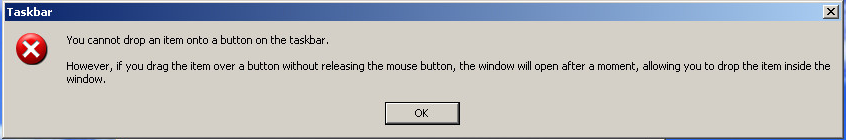
I’m sorry, I’m so sorry, I won’t do it, I promise, please, just leave me alone!
This is clearly the wrong icon for this message. In my opinion, a Warning or Information icon would suit this better.
Then, there is the wording. First, it sort of shouts at you YOU CANNOT DO THIS. Afterwards, it sort of wants to stay friends and tells you what you actually CAN do.
What did you do wrong? Well, you made an accidental mistake. Either you slipped out, or you wanted to drag this to the task bar, maybe put it into Quick launch. Reeeeally not the right time to let an error message like this spit in the user’s face like he just wiped out the entire disk. They god rid of this message in Vista for a good reason.
Give the user the right choice
This one seems to be the opposite, but it is about selection. You have to balance between the user’s need
- to adapt your application to his workflow
- to work quickly with default settings
- to understand what the settings actually mean
For every setting, think about:
- are there REALLY users who will change this?
- what is a good default setting?
- can I explain this setting quick and thorough?
This may change with your audience:
- If you’re developing an application for Everyday Man, give less configuration tasks, set good default settings and explain what they do in clear and concise language.
- If you’re doing this task for an enterprise-level firewall, provide a setting when in doubt. DO give it a good default setting and if you CAN’T explain it quickly, do not dumb it down, but refer to the manual then. There is nothing worse than complicated settings with wide impact that seem like a choice of colour.
This is a balancing act. I have to say, Apple has made a good point in this. When developing, I often take a peek at them. I have to say though, they sometimes dumbed it down a little bit too much and this issue seems to develop on the OS X platform now. Either you can work like Apple wants you to, or you’re lost, off the track and there’s no way to bend the track.
A good example is the recently lost Javascript setting in Firefox. Of course, it IS reasonable to turn off Javascript, e.g. if you want to skip ads or prevent tracking. The problem is: If you do this by accident, like when Everyday Joe scrolls through the settings, your web will look broken.
They made it right: this setting is not available anymore on the UI. If you really want to turn off Javascript, then you know why and can turn it off in about:config, or using your favourite addon.
Wording
This is far more easy in English, than in German
- Most technical terms are English and an unknowing user may know what it means by picking words apart
- English is shorter
However, there are some good points in German
- German is conciser
- When translated right, technical terms are far more easy to understand than in English, since they’re usually not made up from Latin words
The last part is the most difficult and Microsoft has a great history of doing it wrong. If you translate some of their terms back to English, you can see what that actually meant, since they just translated word by words. This has gotten a lot better in recent versions of Windows though.
However, Microsoft has a really good section on wording in their UX guidelines that I encourage everyone to read, whether or not you develop for this platform
Don’t fool your users
The actually worst thing you can do, is install adware. I JUST want to install my Flash player. Why would I need Chrome? It’s got Flash built-in, so then I wouldn’t need a separate Flash player anyway. Safari had the same thing, but hidden until after an update, with Apple Software Updater. If you were to install Quicktime, just to play movies in the .mov-format, all went great. No bloatware, just Quicktime and it worked.
But waaaaait ‘till there is an update: You know, users just click next-next-next on these installation wizards, because they think they’d understand nothing anyway. Well, Apple exploited that fairly mean: On updating Quicktime, Safari and iTunes were checked too, so after updating your small player, you had a whole music library manager and a browser too.
The worst example although is Java. If you install it from their web site, Ask Toolbar is checked by default when installing.Well, just take the offline installation, it isn’t included there and is even proxy-friendlier. But again, wait for the update. Guess what? Ask Toolbar is back in place, ready to be installed on PCs of non-suspecting users and ready to shove its crap advertising all over the place. Sorry for this, but there are no other words. I have NEVER seen a user use that bloody toolbar by choice, or using their new fancy forced-default search engine instead of the ol’ Google.
What do we learn from here? Never assume your users are dumb-shit people who have no time to read through everything. THEY have work to do, so assist them. It’s hard to scrub that image off too: remember, a liar will not be believed even when he speaks the truth.
Stop feature-creepism
The best example for this is Nero Burning ROM. It all started out with a simple CD/DVD burner. It did this well, you could burn files, burn music, burn ISOs, fairly anything and pretty easy too! Then, featurism started. After the installation, you had a media player (for video and images) too, that even set itself as the default program.
In later versions, they fit an indexing service too, additional to the built-in Windows one. Unlike this, it had no intelligence of slowing down or stopping its indexing when the computer is actually used, so you could do nothing after the installation. The PC was under constant stress like you’re playing a game, just after booting. The only chance to uninstall this was in Safe Mode, but this is a tool for home users.
Personally, I think this is where the Unix philosophy “do exactly one thing and do this fine” plays an important role. I don’t know what happened to Nero, haven’t used it in ages.
If you want to sell and do more, then create another product. But give the option of buying just the old one, most people will not need everything.
What do we learn?
Well, if you read through all this, you have done a good job. I don’t mean that I am the guru of usability or something, but: you learn a lot from reading people’s opinions. What they like, what they don’t like, what they think will improve this. If you just got into that topic, read a part of MS’s UX guidelines, they are a good starting point. Then search for other usability posts, you will find a lot of them.